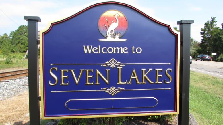
Seven Lakes residents Trevor and Lynn Bourne donated a new sign to the Seven Lakes community at the cost of about $7400. The sign was officially installed by HWY 211 on Monday, July 3rd – just in time for the Fourth of July.
Bourne and his wife moved to Seven Lakes in 1991 – the same year they started their business making signs. He has made signs for Ralph Lauren in Singapore, Madrid, London, and Paris. He has won first place awards in international sign competitions. Bourne also worked with Fort Bragg and made the West End sign fifteen years ago at the request of the business guild.
About two years ago, Trevor and Lynn decided it was time for Seven Lakes to have a sign of its own.
After failing to get community leaders involved in the project, they went on to start the project on their own.
“I wanted to do it for a long time,” the Trevor said. “I decided if nobody else would do it, I would.”
The Bournes created the sign at their business, Rowland Wassall Design Associates doing business as Classic Signs and Sign Blasters.
He began by taking photos of the sign’s location and determined that using earth tones, as he originally intended, would cause the sign to fade into its background location rather than stand out.
“My job as a designer is to get your subconscious mind to take notice,” Bourne said. “[People] only notice something that’s unusual… It takes about seven second for an individual to see and react to a sign.”
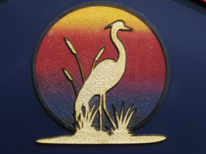 Instead, the Bournes decided to go with a dark violet which appears blue in the sunlight – a representation of the water and lakes.
Suggestions were made as to what the sign’s symbol should be. However, none of them seemed to capture the essence of Seven Lakes as a whole. Finally a heron was chosen due to its versatility.
“You get herons where water is,” the Trevor said.
When designing the sign, Trevor calculated the size of the letters, making them relevant to the distance and speed of passing cars for easier visibility. The “Seven Lakes” letters are prismatic, meaning they take on the shape of a prism and are about three times more work for Bourne.
He chose to add additional details to the sign such as sand blasting textures and gold leafing.
“Paint will never sparkle like that,” he said.
Aluminum posts and a steel frame skeleton were installed to make the sign strong and durable.
“We wanted it to be strong enough to stand the test of time,” he explained.
“It was a lot of effort. It took a lot of time,” Lynn said.
Al Geiger of the Seven Lakes Garden Club helped to organize the location of the new sign and was present when it was installed.
“He couldn’t take his eyes off it,” Lynn said.
“We’ve been talking on and off for the past five to ten years about it,” Al Geiger said.
The Beautification Committee also made a contribution towards the sign.
“The sign is a result of the work of the Seven Lakes Village Beautification Committee – specifically Al Geiger – who worked with [Trevor and Lynn] who provided the sign. This has been in the works for a long time and the Beautification Committee is very appreciative and pleased with the new sign! They will be doing some additional work to make the sign more visible,” said Carolyn Sink – President of the Seven Lakes Garden Club and member of the Beautification Committee.
The tagline of the sign was intentionally left blank with opportunity to add lettering.
It’s time for you to get involved! The community is invited to provide suggestions for the sign’s tagline! All tagline ideas may be emailed to tagline@signblasters.com.